
Mastering the Art of Perfect Logo Placement
- Ever print
- Sep 29, 2025
- 2 min read
Updated: Sep 30, 2025
Logo placement is a critical factor in branding success. It affects visibility, recognition, and the overall impact of your promotional products. I will guide you through the essentials of logo placement. Follow these steps to maximize your brand presence and make every promotional item work harder for you.
Branding Placement Strategies That Work
Start with understanding your product. Different items demand different logo placements. For example:
T-shirts: Place logos on the chest, sleeve, or back collar.
Hats: Front center is best for visibility.
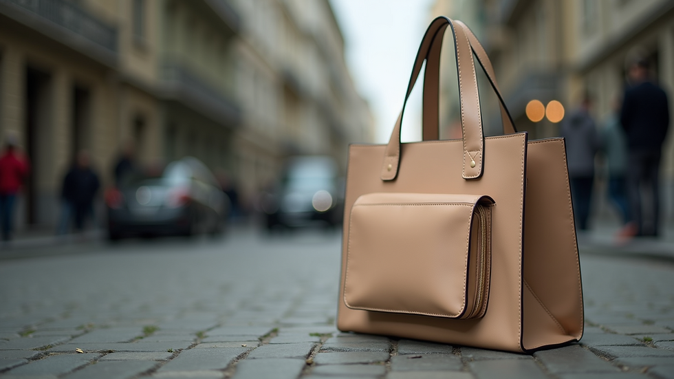
Bags: Front pocket or top flap works well.
Consider the product’s shape and how it will be used. The goal is to place your logo where it will be seen most often and clearly.
Think about your audience’s perspective. Where will they naturally look? Position your logo there. Use contrast to make it stand out. Light logos on dark backgrounds or vice versa grab attention.
Use symmetry and balance. Avoid placing logos too close to edges or seams. This can make the design look awkward or get cut off.
How to Place a Logo Correctly?
Placement is about precision. Follow these rules:
Measure twice, place once. Use templates or mockups to test placement.
Keep size proportional. Too big looks aggressive; too small gets lost.
Align with product features. Use natural lines or seams as guides.
Avoid clutter. Leave breathing space around the logo.
Test visibility. Check from different angles and distances.
For apparel, place logos on the left chest or sleeve for subtlety. For bags and tech accessories, center placement often works best.
Use the logo placement guide to explore detailed examples and product-specific tips. This resource simplifies your decision-making and ensures your logo looks perfect every time.

Choosing the Right Size and Color
Size matters. A logo too large overwhelms the product. Too small, it fades into the background. Aim for balance.
For small items like pens, keep logos minimal.
For larger items like jackets or banners, increase size but maintain clarity.
Color choice impacts visibility. Use your brand colors but adjust for contrast. If your logo is dark, place it on a light background. If light, use a dark background.
Avoid complex color blends on small logos. Stick to solid colors for clarity.
Test your logo in black and white. This ensures it remains recognizable in all formats.
Placement on Different Promotional Products
Each product type has unique placement needs. Here are some examples:
Drinkware: Place logos on the side facing outward when held.
Notebooks: Center front cover or bottom right corner.
Tech gadgets: Top center or bottom corner depending on shape.
Outdoor gear: Visible spots like chest or sleeve on jackets.
Consider how the product will be used daily. Place logos where they will be seen during use.

Final Tips for Maximum Impact
Use high-resolution logo files for crisp printing.
Choose durable printing methods to avoid fading.
Keep your brand consistent across all products.
Ask for samples before finalizing large orders.
Update your logo placement strategy as your brand evolves.
Perfect logo placement boosts brand recall and professionalism. It turns simple products into powerful marketing tools.
Master these strategies and watch your brand presence grow.


Comments